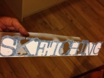
Having reflected on Laura’s comments on my first assignment and conscious that having arrived quickly at what regarded a ‘satisfactory’ conclusion I hadn’t explored the task very much or pushed myself down new avenues a lot. So, I liked her suggestion of expanding the lettering and folding, and this is what I did. Printed out the original pieces (not digitally coloured) at A4 size, onto plain white card. Then I cut them to their individual sizes and folded in on both size, thus making them robust enough to stand on their own and making each appear to have curtains on each side of the type. What occurred to me afterwards was that each of the images came out (by no design), a different size. This gave the three cards a hierarchy that was unintended, though the variety in the sizing was helpful from an aesthetic point of view. (In other words, the nature themed card is not more dominant in my life than sketching for example!). 


Then I had the idea that adding a differentiating symbol representing each card might help. So I cut out symbolic paper pieces for each:

On the whole they are better without the added paper symbols I think……
Hmm, not sure that this might look naff….